
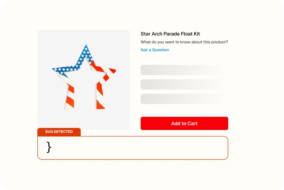
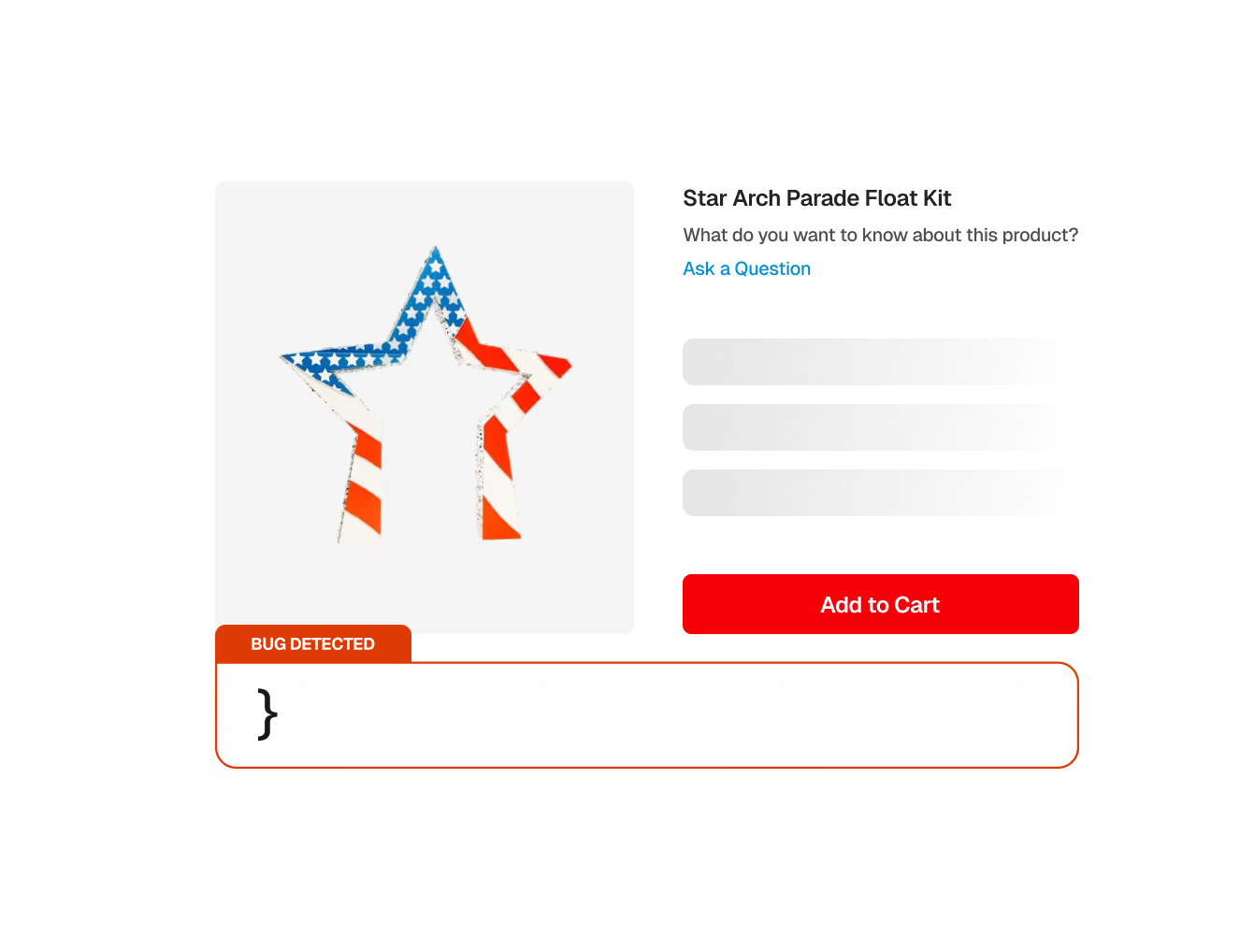
Spur flagged three subtle issues on product pages


What this run
has verified.

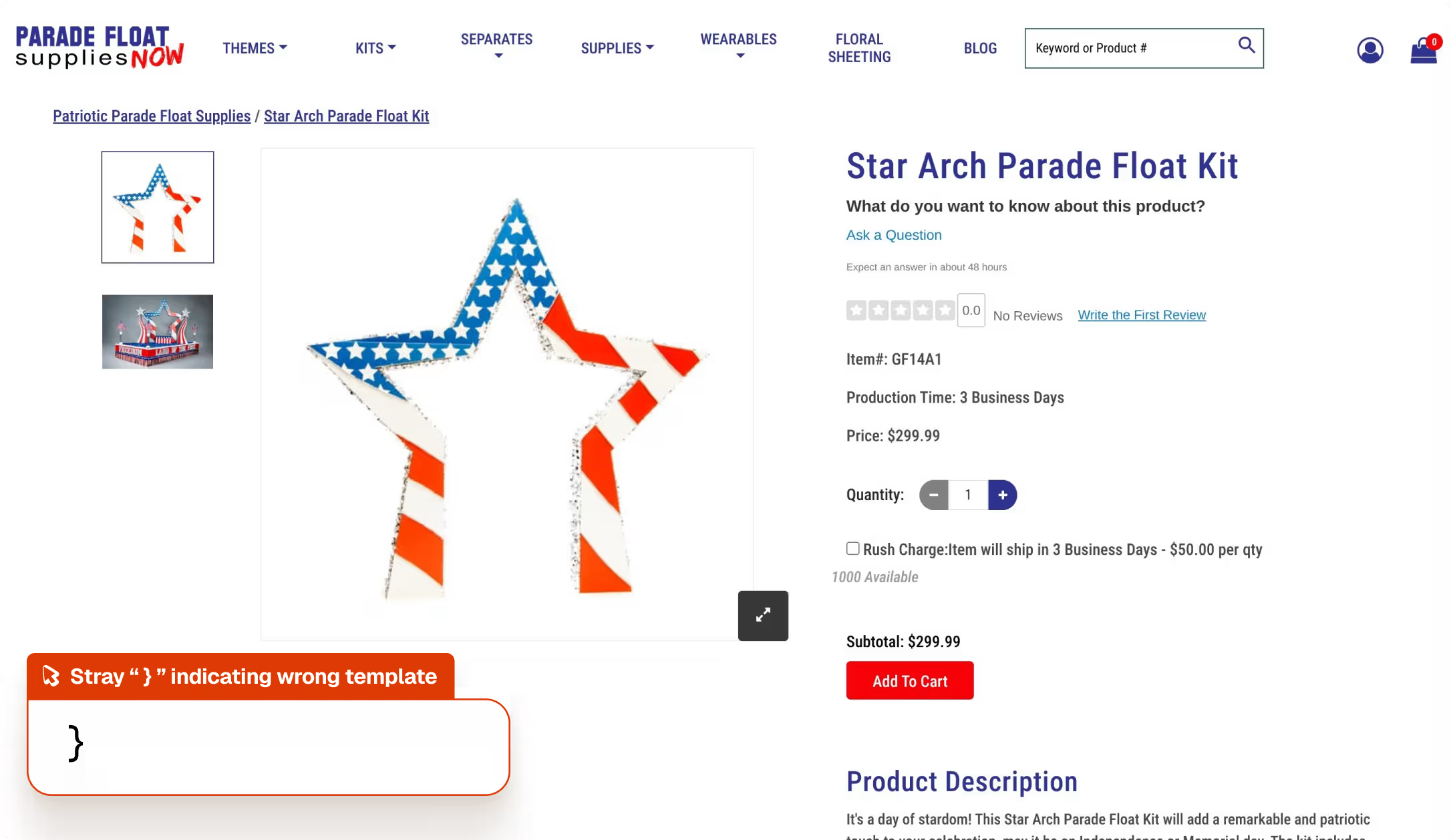
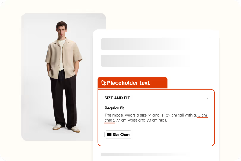
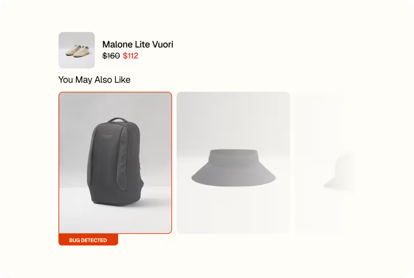
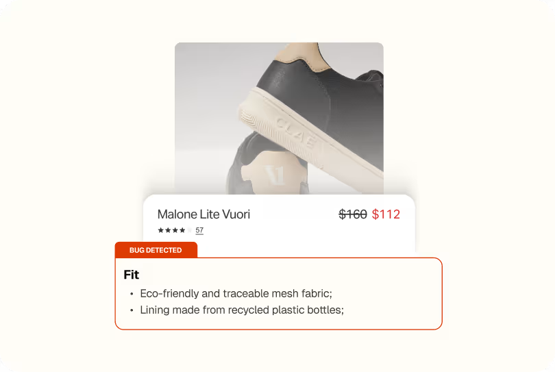
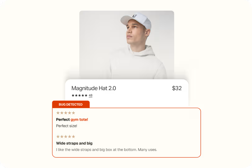
Spur's UI/UX agent ran a full product detail page test, navigating from the homepage, browsing to a product, switching images, adjusting quantity, and adding to cart. Along the way it flagged a template character leak on the product page, an accessibility issue in the image alt attributes, and a hover artifact on the navigation. All three are visible to real users.
Template integrity
No raw code or debug characters rendering in visible areas of the page.
Accessibility
Image alt attributes containing meaningful descriptions.
Navigation behaviour
Nav dropdowns closing cleanly after a link is clicked.
Page polish
A product detail page free of small visual issues that erode trust.
Compare
The customer's live site,

captured by

Spur
during the run.
Before
After

Failure reason: The product page carried three small polish issues at once, a stray } template character leaking into visible text, image alt attributes containing tracking URLs instead of real descriptions (so screen readers read out a link), and a nav dropdown that ghosted open after a link was clicked instead of closing cleanly, together they make the page feel unfinished and hurt accessibility.

What this
one catch saved.
4hrs
Dev time saved
Shipped, these surface separately, a customer notices the stray character, someone flags the nav behaviour, an accessibility audit catches the alt text. Three small fixes become three separate tickets with three separate rounds of QA.
Unnoticed
UI/UX problems
None of these would stop a purchase on their own. But a } on a product page, a dropdown that won't close, and alt text that reads out a URL to screen reader users all add up to a site that doesn't feel fully finished.
5hrs
Manual QA time
Catching all three manually means reading every character on the page, inspecting image attributes, and testing nav interactions carefully, the kind of detail that gets missed in a functional pass/fail checklist.
The actual test
in

UI/UX bug and inconsistencies
A 13-step product detail page and add-to-cart test. Spur navigated from the homepage through to a product detail page, tested image switching, quantity controls, and cart functionality. Three observations were flagged in the process that a standard test run would have marked as complete and moved on from.
Click "I UNDERSTAND" on the cookie consent banner if it appears.
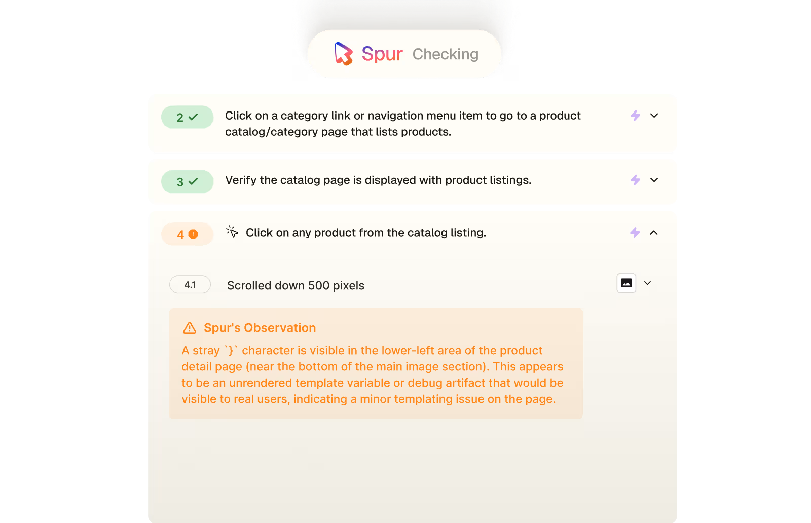
Click on a category link or navigation menu item to go to a product catalog/category page that lists products.
Verify the catalog page is displayed with product listings.
Click on any product from the catalog listing.
Verify the product detail page displays a layout with: a header showing logo, store name, user icon, and shopping cart icon; a breadcrumb; a main product image with additional images (either in a carousel below or in a vertical strip to the left); the product name; a quantity control (stepper with +/- buttons or a dropdown); an "Add to Cart" button; a "Subtotal" with a price; and a product description.
Click a different image from the additional images (carousel or vertical strip).
Verify the main image changes to display the selected image.
Click the "+" button on the quantity stepper (or expand a quantity dropdown if present) to increase the quantity to 2.
Verify the quantity shows 2 and the Subtotal price updates to reflect the new quantity (2x the unit price).
If there are dropdown boxes for options like size, format, or color, expand one and select a different option.
Verify the selected option is shown and the Subtotal price updates to reflect the change.
Click the "Add to Cart" button.
Verify the shopping cart page or side cart is displayed with the product listed at the correct price and quantity.

Copy


Site Merchandising
Site Merchandising
Checkout Interactions

Accessibility
Payment
.avif)
Checkout
.avif)