
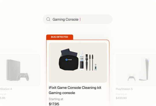
Spur flagged four UI issues on Docusign's Brazilian pricing page in a single pass

What this run
has verified.

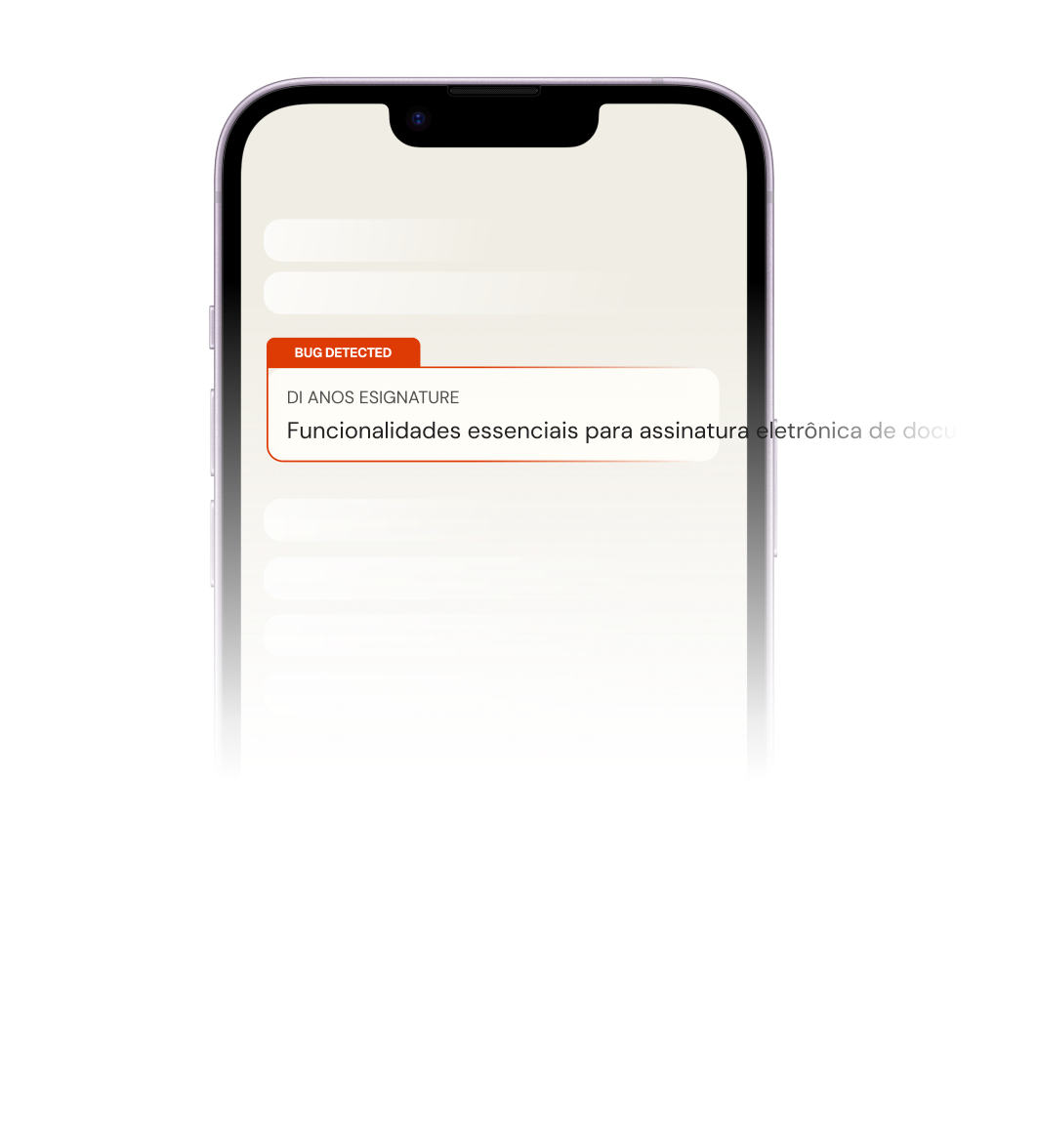
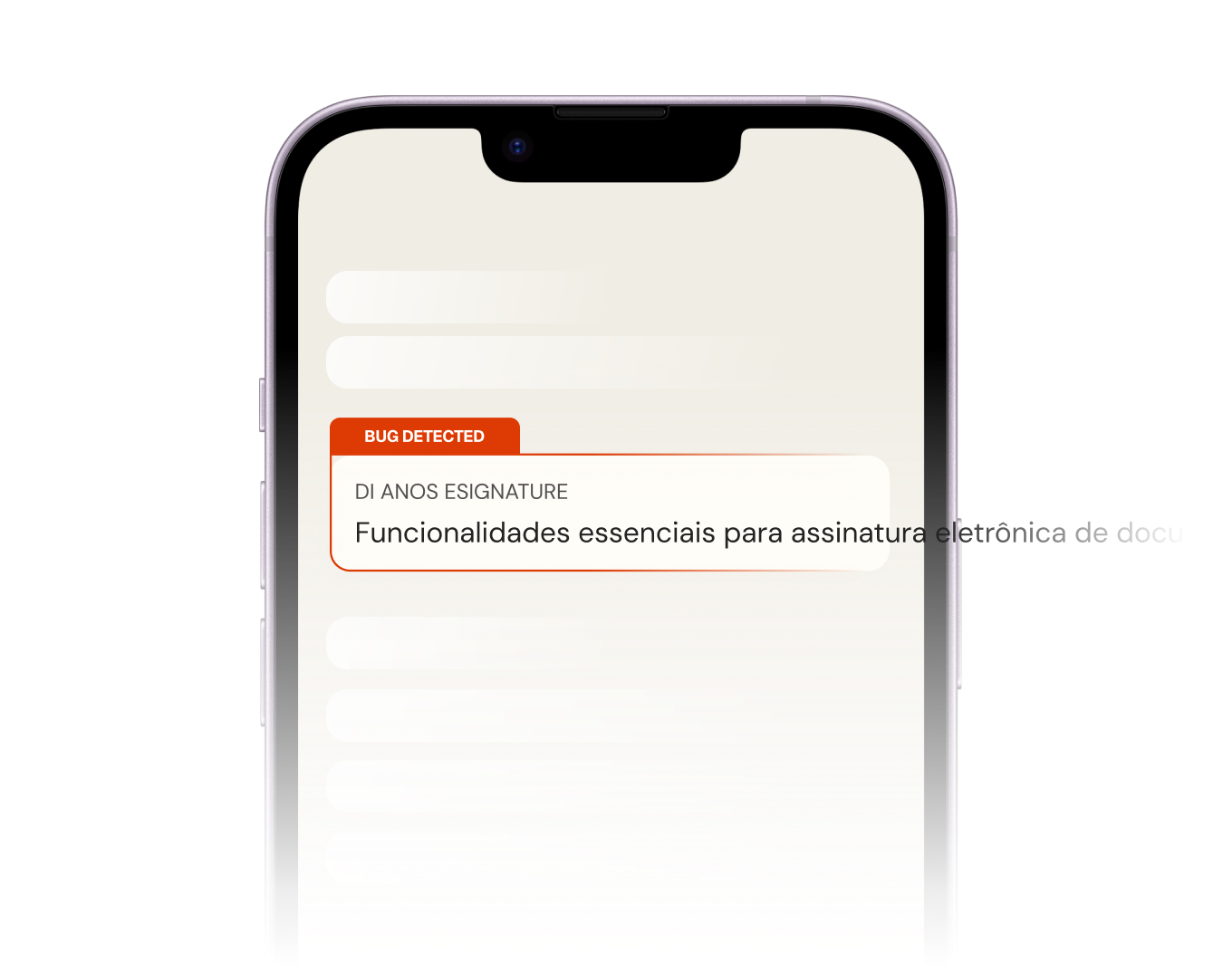
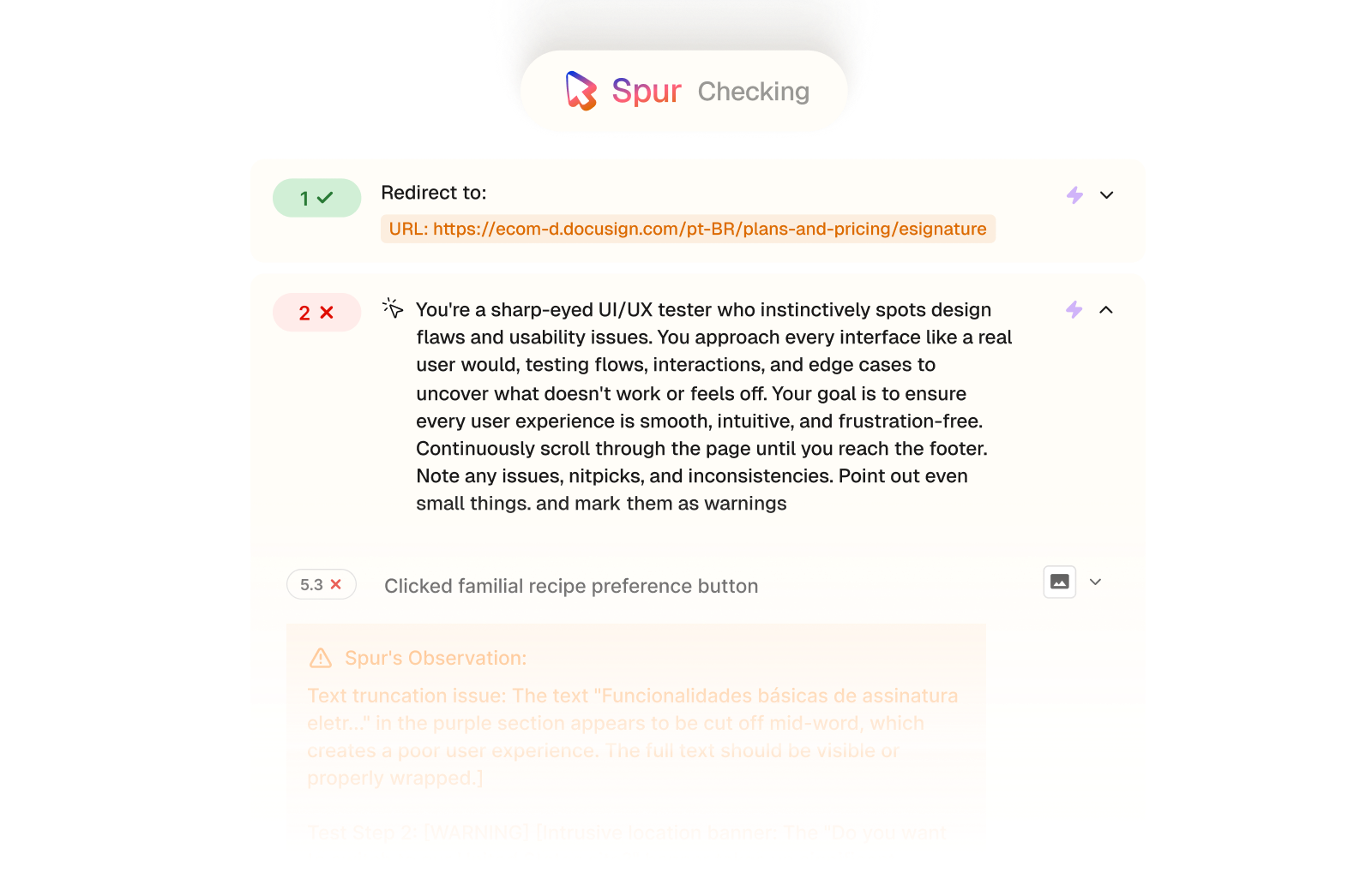
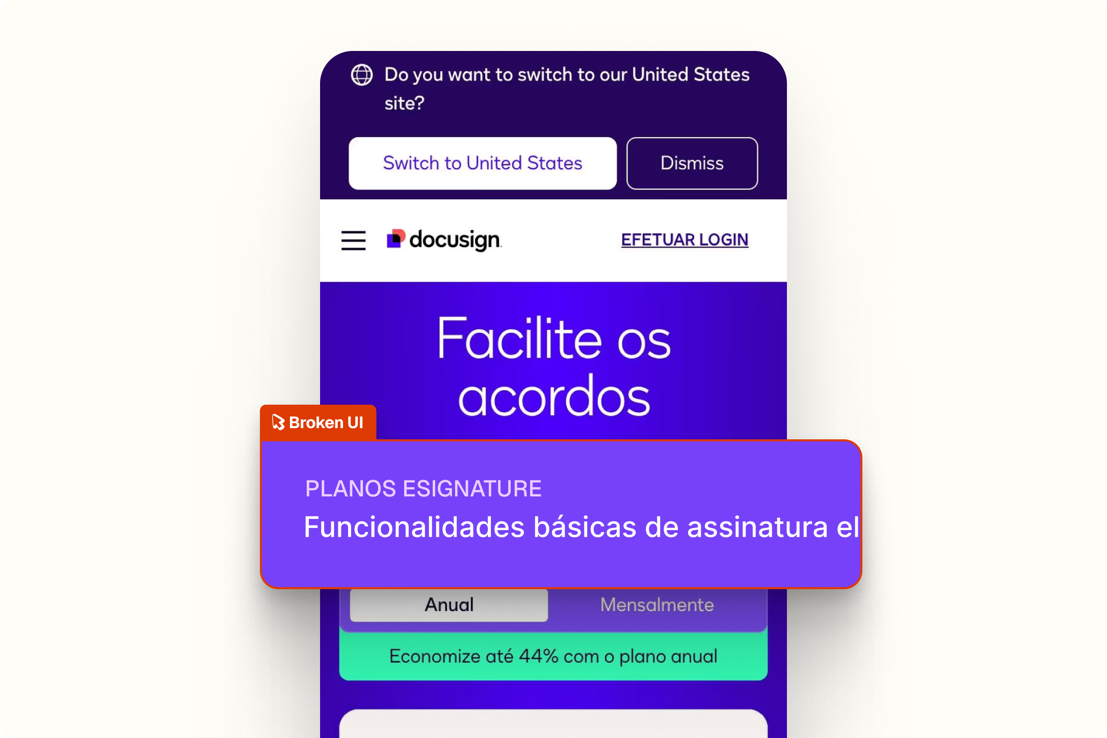
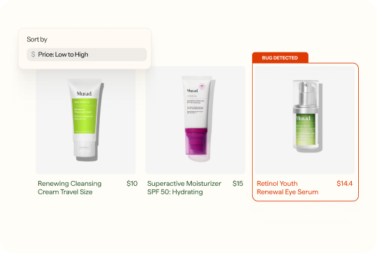
Spur's UI/UX agent scrolled through Docusign's Brazilian pricing page top to bottom, flagging anything that looked off. It came back with four issues, from truncated feature text to inconsistent button styling.
Visual consistency
UI elements following a unified design language across the page.
Typography integrity
Text rendering correctly without truncation or overflow.
Layout accuracy
Icons, buttons, and banners at the correct size and position.
Trust signal
A pricing page polished to support a confident purchase decision.
Compare
The customer's live site,

captured by

Spur
during the run.

You're a sharp-eyed UI/UX tester who instinctively spots design flaws and usability issues
What this
one catch saved.
6hrs
Dev time saved
Shipped, these issues get reported one at a time through customer feedback or design reviews, each one a separate ticket, a separate fix, a separate round of checking it didn't break anything else.
Polished
Customer experience
A pricing page is where buying decisions happen. Four small rough edges on that page add up to a product that feels less trustworthy than it is.
5hrs
Manual QA time
Catching all four manually means someone sitting with the page long enough to notice misaligned icons, read truncated strings, and compare button styles, the kind of detail that gets missed in a quick sign-off.
The actual test
in

UI/UX Inconsistencies
A single-step UI/UX audit of Docusign's international pricing page. Spur scrolled the full page as a real user would and surfaced every visual inconsistency it found, flagging four separate issues ranging from layout problems to broken typography hierarchy.
You're a sharp-eyed UI/UX tester who instinctively spots design flaws and usability issues. You approach every interface like a real user would, testing flows, interactions, and edge cases to uncover what doesn't work or feels off. Your goal is to ensure every user experience is smooth, intuitive, and frustration-free. Continuously scroll through the page until you reach the footer. Note any issues, nitpicks, and inconsistencies. Point out even small things. and mark them as warnings
Multiple UI/UX inconsistencies
.avif)
Checkout


.avif)
UI/UX
.avif)
Pricing
Interactions
Checkout
UI/UX
AI Feature Error