Multiple UI/UX inconsistencies on international pricing page
.avif)


Step the Agent Failed on:
- 1 You're a sharp-eyed UI/UX tester who instinctively spots design flaws and usability issues. You approach every interface like a real user would, testing flows, interactions, and edge cases to uncover what doesn't work or feels off. Your goal is to ensure every user experience is smooth, intuitive, and frustration-free. Continuously scroll through the page until you reach the footer. Note any issues, nitpicks, and inconsistencies. Point out even small things. and mark them as warnings
End-to-end checkout Flow
Full Test That Was Run:
Text truncation issue: The text "Funcionalidades básicas de assinatura eletr..." in the purple section appears to be cut off mid-word, which creates a poor user experience. The full text should be visible or properly wrapped.] Test Step 2: [WARNING] [Intrusive location banner: The "Do you want to switch to our United States site?" banner takes up significant vertical space on mobile (approximately 15-20% of the viewport), which pushes important content below the fold and may frustrate users who want to stay on the Brazilian site.
Multiple minor UI/UX issues identified: 1. Typography Hierarchy - Benefits section heading "Os benefícios básicos incluem:" uses small font size that doesn't provide clear visual hierarchy from body text 2. Icon Alignment - Benefits list icons show inconsistent vertical alignment with corresponding text 3. Button Style Inconsistency - Mixed button styles (solid "Comprar agora" vs outline "Ver todas as funcionalidades") create unclear visual hierarchy 4. Text Truncation - "Funcionalidades básicas de assinatura eletr..." appears cut off without proper ellipsis handling
- 1 You're a sharp-eyed UI/UX tester who instinctively spots design flaws and usability issues. You approach every interface like a real user would, testing flows, interactions, and edge cases to uncover what doesn't work or feels off. Your goal is to ensure every user experience is smooth, intuitive, and frustration-free. Continuously scroll through the page until you reach the footer. Note any issues, nitpicks, and inconsistencies. Point out even small things. and mark them as warnings
Bug Book
These are production bugs found for our actual customers
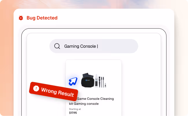

Search results for “gaming console” show accessories instead of consoles

Multiple UI/UX inconsistencies on international pricing page
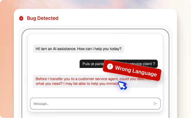
AI chat responds in English instead of French
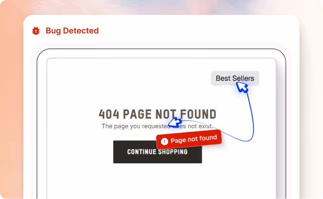
“Best Sellers” link in header leads to a 404 page
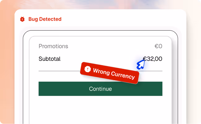

Checkout shows incorrect price or currency for Germany shoppers
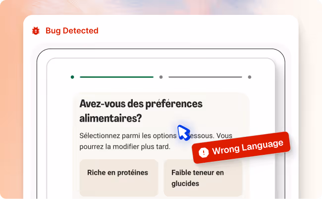
French (Belgium) users see incorrect language during checkout
.avif)
Chat responses fail during long conversations
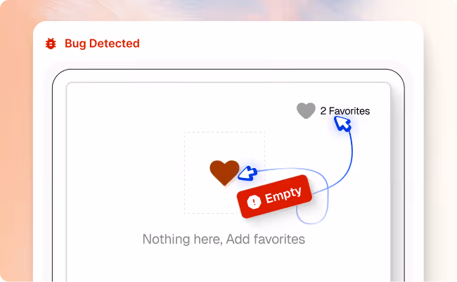
Liked Item Missing From Favorites
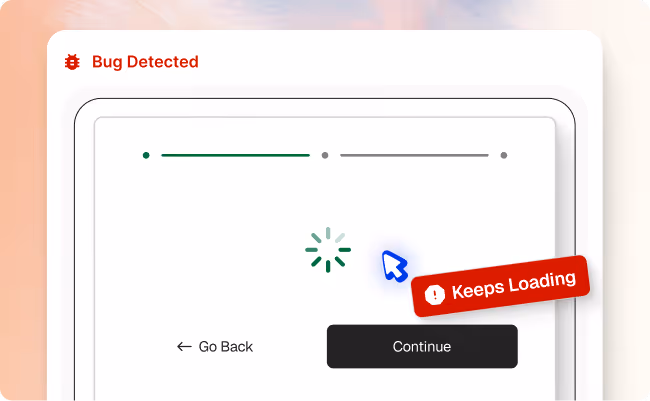
Meal selection page stuck loading
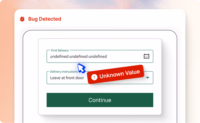
Delivery date is not displayed correctly
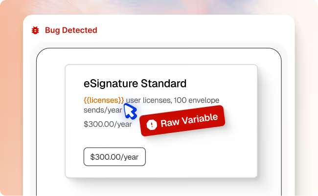
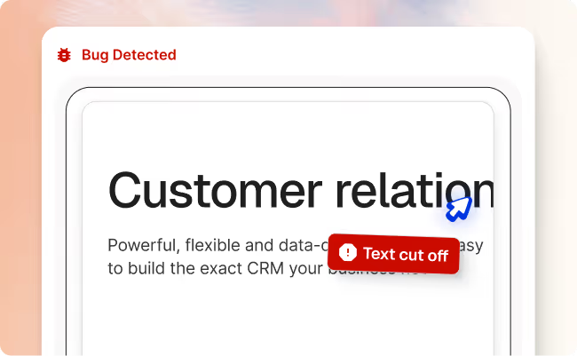
Subscription plan displays raw template text
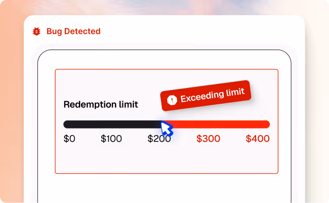
Rewards page shows incorrect annual redemption limit
Platform: Native Mobile App (Android)
Device: Pixel 4a
Android Version: 35
User Type: Tobacco Member
Test Result: Failed at step 5 - Points display configuration error
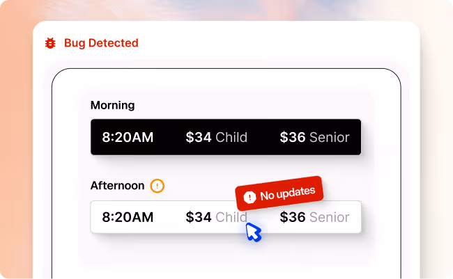
Afternoon time slots don’t appear when selected
Platform: Web Browser
Website: Rockefeller Center
Test Type: E2E Purchase Flow
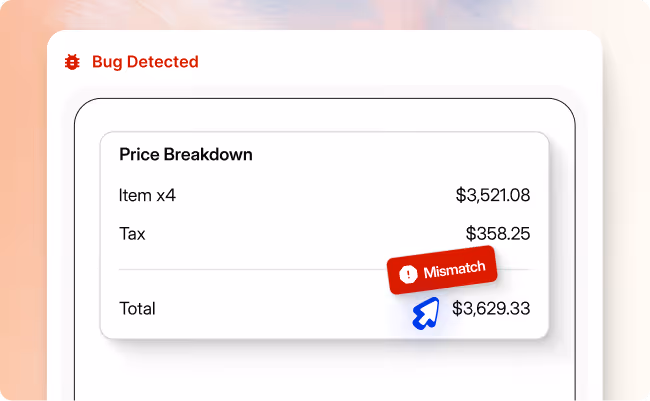
Total cost shown is wrong at checkout
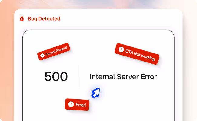
Checkout button leads to error page
Checkout completion rate, conversion rate, revenue
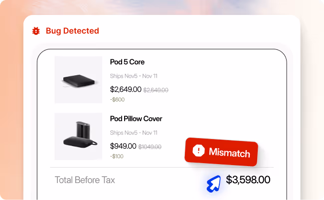
Checkout total is higher than expected
Revenue accuracy, pricing accuracy, discount validation, checkout conversion rate
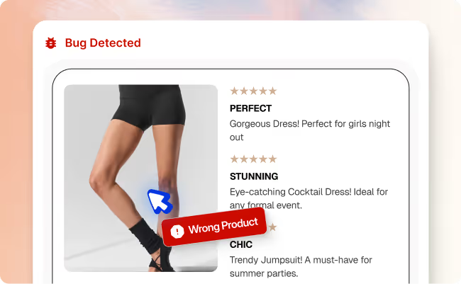
Reviews reference a different item (dress) on shorts page
- Prevented over $400k in lost sales
- Saved 21 hours in dev time on the bug
- Automated 21 hours in dev time on the bug
Schedule A Demo
We invite you to try us out with our new Pilot Program